Article
Case Study – DOM Medica Rebranding
Branding
Challenge
How do you translate the humanistic dimension of the brand – care, closeness, and helping patients live better – into a visual and communicative language that is consistent, modern, and understandable?
Solution
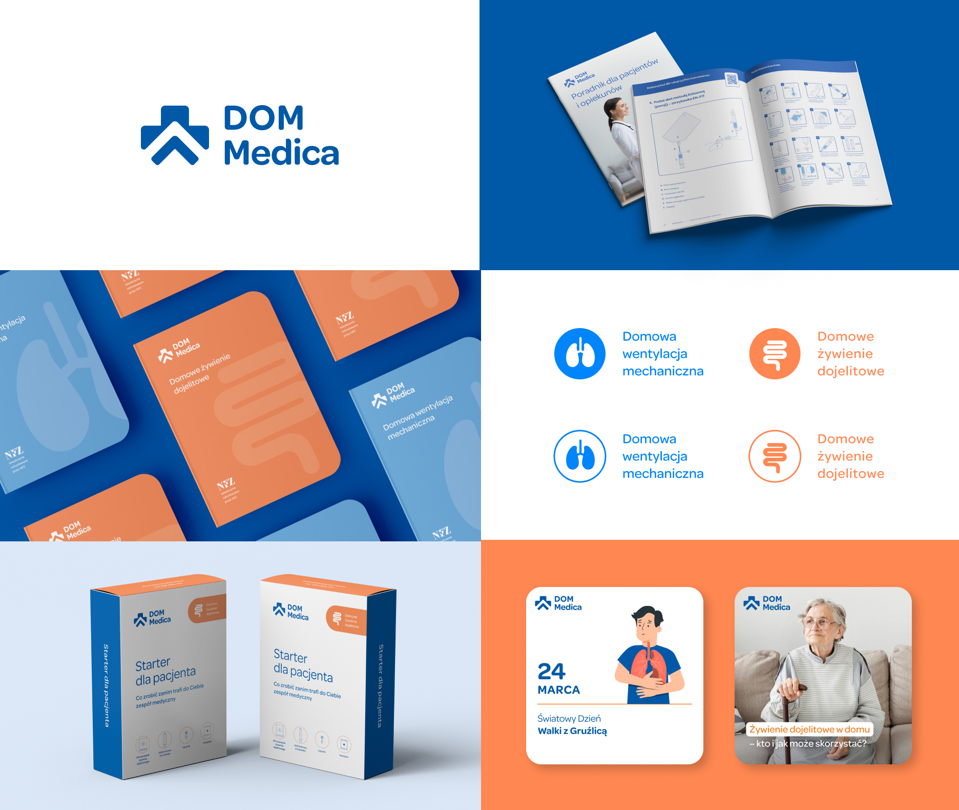
Logo – We created a symbol combining a house and a medical cross in a modern, minimalist form. It’s a visual metaphor for medical care in a safe, home environment. Color palette – We introduced a color system that serves as a navigation tool and organizes communication. This made materials more intuitive and clear. Communication – From patient leaflets to social media to business materials, every format was unified and given a tone that emphasizes empathy and support. Internal materials – We also ensured consistent communication within the organization, helping the team carry the same story externally.
Result
DOM Medica received an identity that says less but means more. The brand began to be perceived as patient-focused, modern, and coherent – both by patients and business partners. New communication tools made it easier to build trust and create a positive brand experience.
Conclusion
Branding is not just a logo – it’s a language that makes others want to listen to your brand. In healthcare, strong branding is not about being loud; it’s about simplicity, consistency, and empathy, because the patient and their family are always at the center of the story.
Need help? Contact us!